Chest Physician

Marriage Counselling

Acupuncture

Second-hand shop

Yoga/fitness

Personal trainer

Proof reader

Stylist


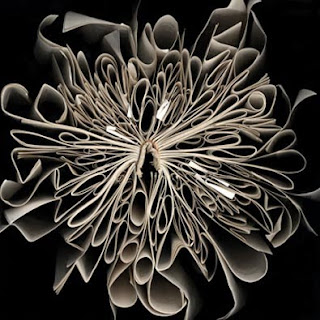
Butterfly
Texan artist Cara Barer bases her work on taking photographs of the edges of pages, in whimsical and elegant positions. Her inspiration came when she photographed whe intricately bent pages of a wet Yellow Pages book. After this, she moved onto other books, carefully positioning the pages into beautiful designs on a studio black background.
 Shitake


 'Red Charlie' by Ron Wood of the Rolling Stones paints very lifelike portraits - who knew you could be so skilled at two things?!


The first was well thought out, dark, twisty and like nothing I've seen before. Great!
The second was predictable, gory, hectic and yet somehow still pretty good.
The third was sickening, far-fetched and a step too far.
So six films later, I'm not quite sure what the producers are thinking, or where they are going. It's not original anymore - hopefully they're not going for a horror version of James Bond, because I'm not sure I can cope with 21 Saw films. Not that it directly affects me, but they're taking up precious cinema slots.
Defintely less a case of 'Do you dare?' and more 'Do you care...?'
 I was recently watching Dragon's Den, and was less than impressed with 'Reestore's' pitch to the Dragons, which included seating which was made from old shopping trollies. These designs might not look out of place in a hospital ward, however I can't imagine them enhancing the aesthetics of a modern style apartment. Unsurprisingly, I was shocked when two of the Dragon's decided to invest £50,000 in the project.


 Recently, the cleverness of Amazon's logo was brought to my attention, where the 'a' and the 'z' are connected with an arrow, implying that they sell everything from A to Z.
 These really are the most effective, memorable logos. Just take a look at the logo for The Guild of Food Writers. Clever illusions within logos are definitely the way forward.
 "Little fluffy rabbits who just don't want to live anymore"


 At first glance, I barely noticed yet another wacky window display in Harvey Nichols. However, upon closer inspection, I realised that the figures were in fact made up entirely of wooden clothes hangers. I can only imagine how long these displays took to create, but I'd say it was certainly worth the hours of work.