Wednesday, October 21

Self promotion

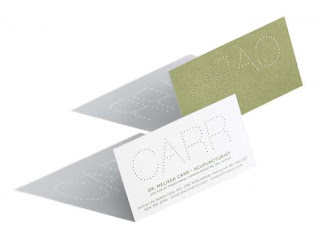
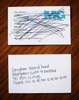
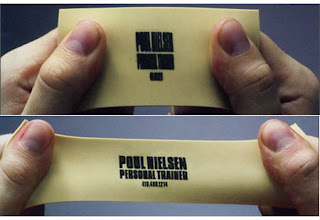
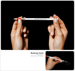
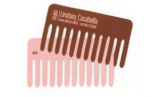
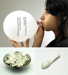
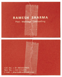
Here are some unusual business card designs I have been looking at recently as a self-promotion technique. I think the most effective ones incorporate the specific business/speciality into the design of the card:


Chest Physician


Marriage Counselling


Acupuncture


Second-hand shop


Yoga/fitness


Personal trainer


Proof reader


Stylist

Sunday, October 4

OK!


These images feature in the toilets of OK Karaoke in Leeds' City Centre. The images incorporate the logo of the bar into their toilet signs. I think they're really clever, and appropriate.


Cleansing graffiti


I have seen this advertisement, along with numerous other similar ones around the Hyde Park area. They are advertising 118's online menu and instead of being sprayed on the floor in paint (which probably would create some negative publicity for the company), the pavement around the stencil has been cleaned, making the advertisement stand out. I think this is a really clever, unusual way of advertising. It's quirky, unique and memorable; i love that it's not in any way damaging, but in fact the total opposite.

Thursday, October 1

Shockvertising


It's a question that's lingered for quite some time, but never really been properly answered: Is shock advertising effective, or are the audiences too shocked, and busy complaining to take notice of the advert's actual message?

The main companies I can think of that manage to create plenty of enemies and receive masses of complaints are Benetton and Barnardo's. One particular Barnardo's campaign that featured in several newspapers before being banned consisted of a baby injecting itself with heroin. There are some positive reviews however - some think shock is necessary in order to successfully deliver the message:

"Anything that wakes people up to this is for the better. People sit around with their heads in the sand too often" - Roger Alton, The Observer.

The editor of the Guardian claimed that its readers were sophisticated enough to deal with it and understand the message. However this clearly wasn't the case. It's likely that audiences will be more accepting of shock advertising if it for a good cause, but sometimes charities can't even escape the fact that their message won't outweigh the horror that the audiences feel. I think this'd be a great subject to investigate further, as I'd really like to explore whether it is possible to ethically deliver such a shocking message about such horrific topics, or whether shock is the only way forward.
Big-headed Art


About a year ago, as I was gazing out the window of a coach whilst heading down the M62, I saw what I thought was a giant white head on a hill gazing right back at me. And then it was gone, we'd passed, and I had no idea what, why and even IF it was there. But of course, it was. I look out for it each time I pass, and it literally is a huge sculpture of a head. It wasn't until I was watching Channel 4's Big Art programme that I discovered the 20 metres high 'Dream' was designed by Jaume Plensa. It takes the form of the head of a girl with her eyes closed, in a seemingly dream-like state. The artist intended the sculpture to represent looking towards a brighter future and creating a beautiful place on what was a former spoiler heap.


I think the piece is highly inspirational and the 'brighter future' is well-represented as Dream pays no attention to the relics of heavy industry around - or beneath - her. Her zen-like meditation will remain no matter what.

Tuesday, September 29

Sculpture in Painting


The Henry Moore institute in Leeds' latest exhibition explores the relationship between art and 3D. A campaign, starting next week aims to maximise the number of visitors by using large-format graphics, posters, and giving away free merchandise. It sounds like the campaign might reel in the visitors, but I just hope the exhibition itself lives up to all the hype. Having seen several exhibitions at the Henry Moore institute, I can't say I've ever been overly impressed; The last one, 'The New Monumentality' was hardly exhilarating.

Tetley's Good Earth


The identity, branding and packaging of a new range of Tetley products, 'Good Earth' is currently underway. The new product is organic and is based around 3 principles to display its properties:

- Good for the planet
- Good for others
- Good to you

The 'secret' halo above the 'e' in the logo reflects the product's 'goodness', as do the soft lowercase letters. Not obviously linked to Tetley's, and with a sense of honesty attached to it, I think this product will prove quite popular.